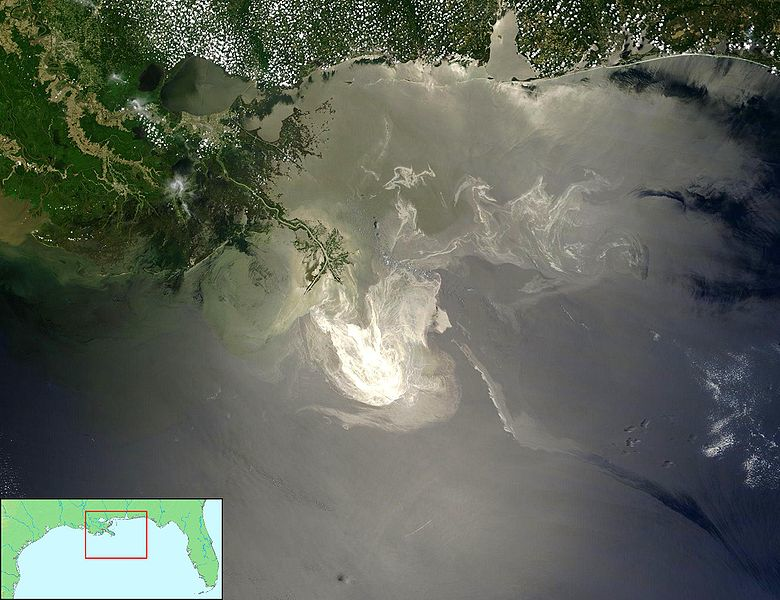
Deepwater Horizon Oil Spill
Eric Hare
qplot(Longitude, Latitude, colour = callSign, data = floats) +
    coord_map()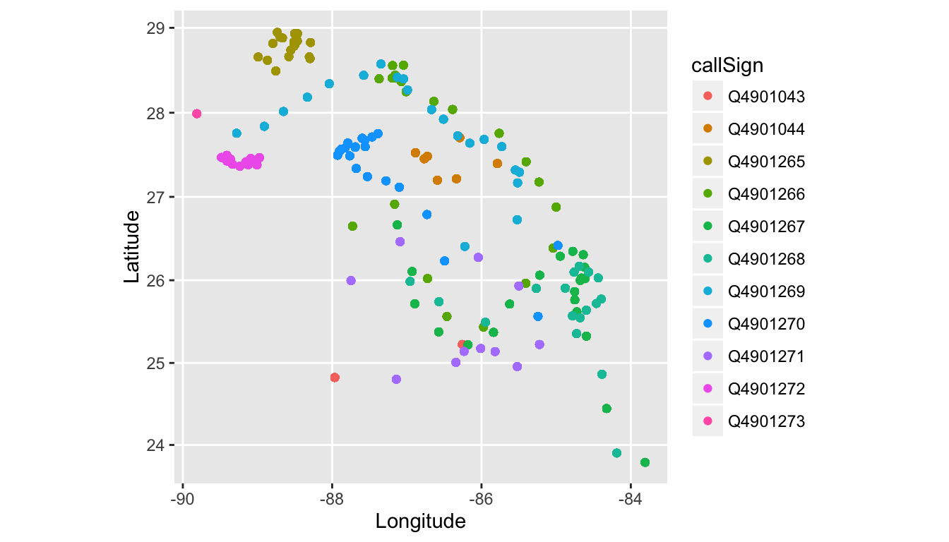
qplot(Longitude, Latitude, colour = callSign, data = gliders) +
    coord_map()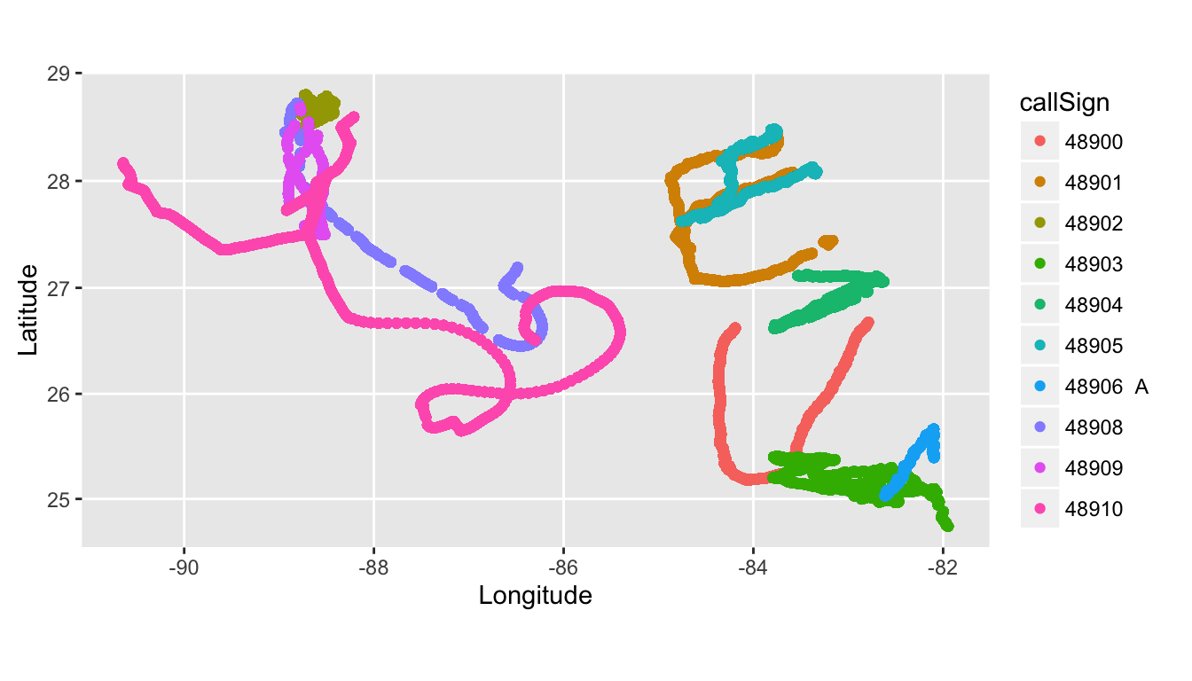
qplot(Longitude, Latitude, colour = callSign, data = boats) +
    coord_map()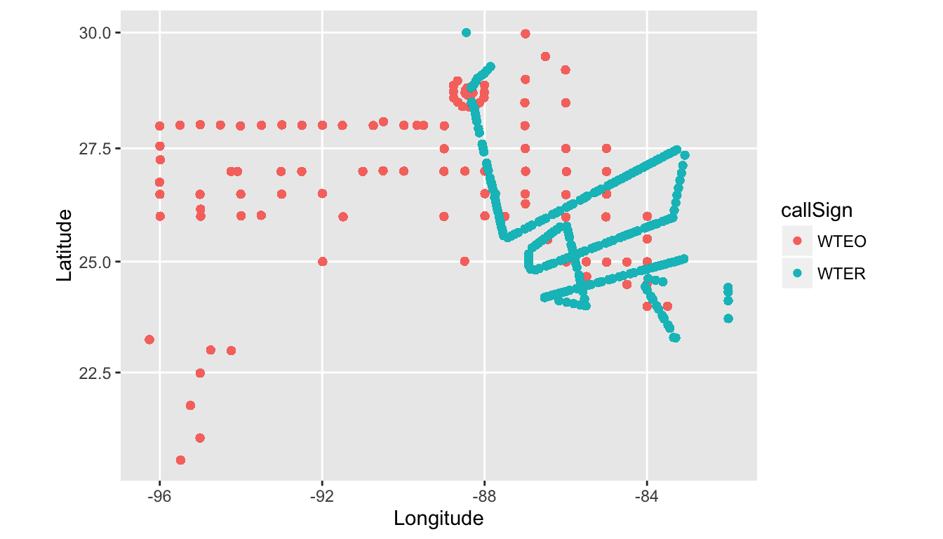
To give you an idea…
states <- map_data("state")

ggplot() +
    geom_path(data = states, aes(x = long, y = lat, group = group)) +
    geom_point(data = floats, aes(x = Longitude, y = Latitude, colour = callSign)) +
    geom_point(aes(x, y), shape = "x", size = 5, data = rig) +
    geom_text(aes(x, y), label = "BP Oil Rig",
              size = 5, data = rig, hjust = -0.1) +
    xlim(c(-91, -80)) + ylim(c(22,32)) + coord_map()
We fortunately don’t need to be so verbose - Even ggplot() will automatically pick default scales:
ggplot(data = floats,
       aes(x = Longitude, y = Latitude, colour = callSign)) +
  geom_point()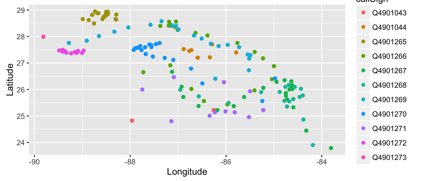
ggplot() +
    geom_path(data = states, aes(x = long, y = lat, group = group)) +
    geom_point(data = floats, aes(x = Longitude, y = Latitude, colour = callSign)) +
    geom_point(aes(x, y), shape = "x", size = 5, data = rig) +
    geom_text(aes(x, y), label = "BP Oil Rig", size = 5, data = rig, hjust = -0.1) +
    xlim(c(-91, -80)) +
    ylim(c(22, 32)) + coord_map()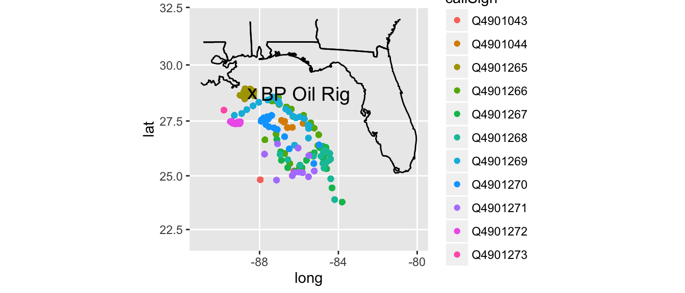

animal <- read.csv("http://heike.github.io/rwrks/02-r-graphics/data/animal.csv")