Interesting new package for creating slideshows
xaringan
Maybe check it out.
You have presentations coming up.
Tuesday, December 13th, 9:45, this room.
Interactions
ggplot(sim3, aes(x1, y)) +
  geom_point(aes(colour = x2))
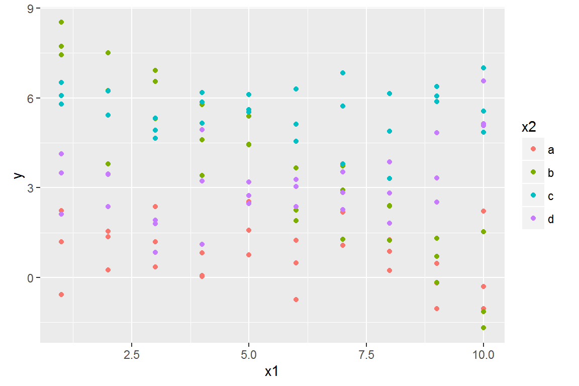
There are two possible models you could fit to this data:
mod1 <- lm(y ~ x1 + x2, data = sim3)
mod2 <- lm(y ~ x1 * x2, data = sim3)
When you add variables with +, the model will estimate each effect independent of all the others. It’s possible to fit the so-called interaction by using *. For example, y ~ x1 * x2 is translated to y = a_0 + a_1 * a1 + a_2 * a2 + a_12 * a1 * a2. Note that whenever you use *, both the interaction and the individual components are included in the model.
To visualise these models we need two new tricks:
- We have two predictors, so we need to give
data_grid() both variables. It finds all the unique values of x1 and x2 and then generates all combinations.
- To generate predictions from both models simultaneously, we can use
gather_predictions() which adds each prediction as a row. The complement of gather_predictions() is spread_predictions() which adds each prediction to a new column.
Together this gives us:
grid <- sim3 %>%
  data_grid(x1, x2) %>%
  gather_predictions(mod1, mod2)
grid
## # A tibble: 80 × 4
##    model    x1     x2     pred
##    <chr> <int> <fctr>    <dbl>
## 1   mod1     1      a 1.674928
## 2   mod1     1      b 4.562739
## 3   mod1     1      c 6.480664
## 4   mod1     1      d 4.034515
## 5   mod1     2      a 1.478190
## 6   mod1     2      b 4.366001
## 7   mod1     2      c 6.283926
## 8   mod1     2      d 3.837777
## 9   mod1     3      a 1.281453
## 10  mod1     3      b 4.169263
## # ... with 70 more rows
We can visualise the results for both models on one plot using facetting:
ggplot(sim3, aes(x1, y, colour = x2)) +
  geom_point() +
  geom_line(data = grid, aes(y = pred)) +
  facet_wrap(~ model)
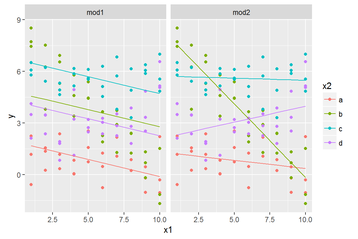
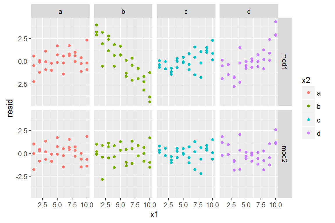
Which model is better for this data? We can take look at the residuals.
sim3 <- sim3 %>%
  gather_residuals(mod1, mod2)

ggplot(sim3, aes(x1, resid, colour = x2)) +
  geom_point() +
  facet_grid(model ~ x2)
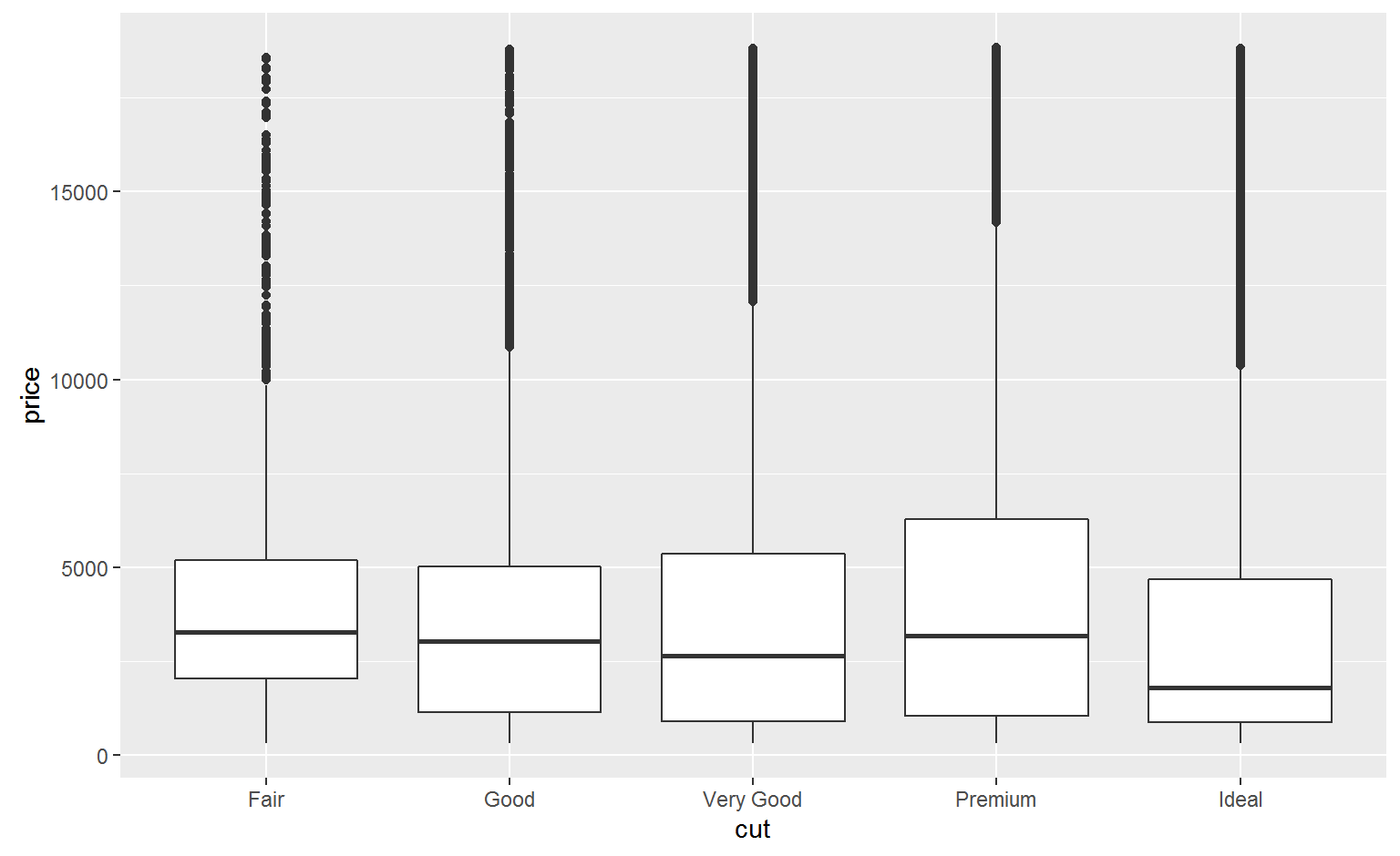
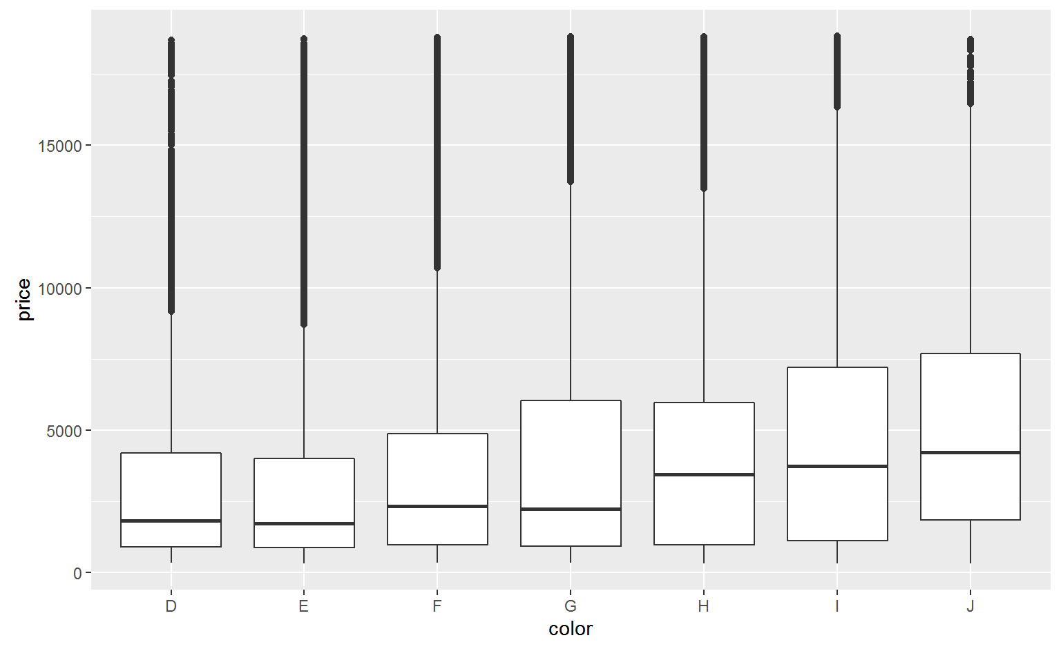
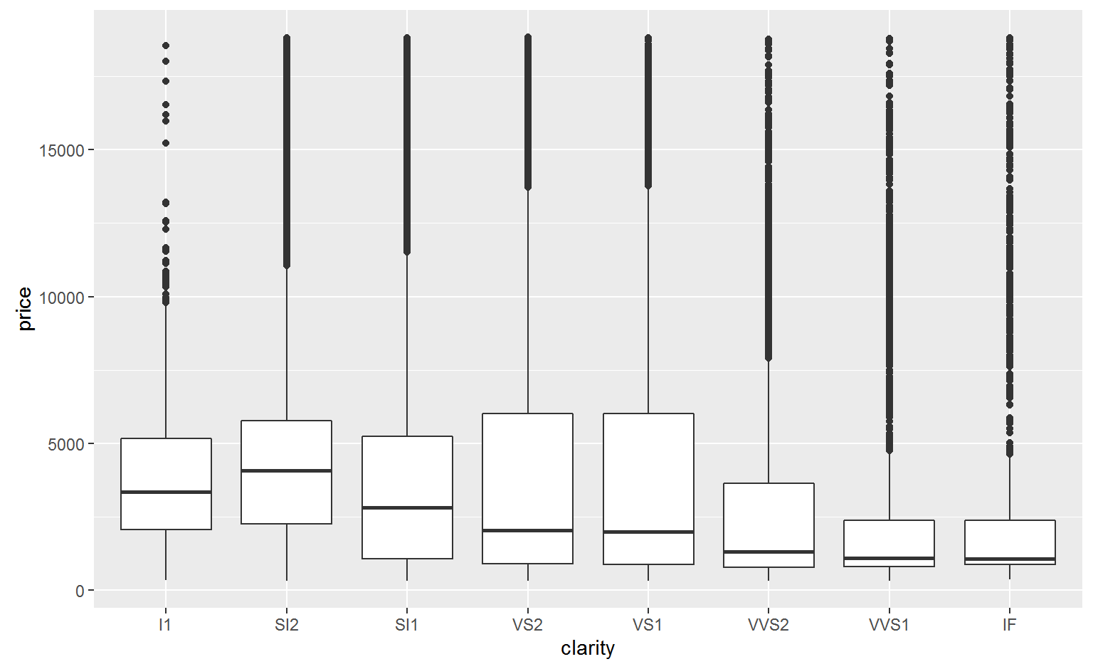
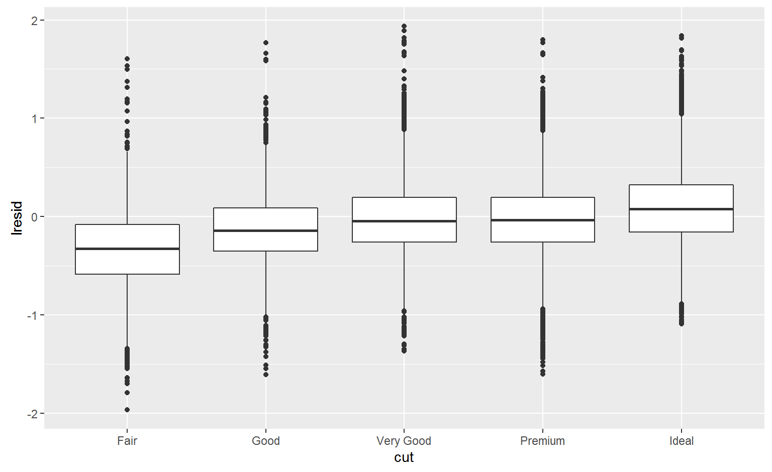
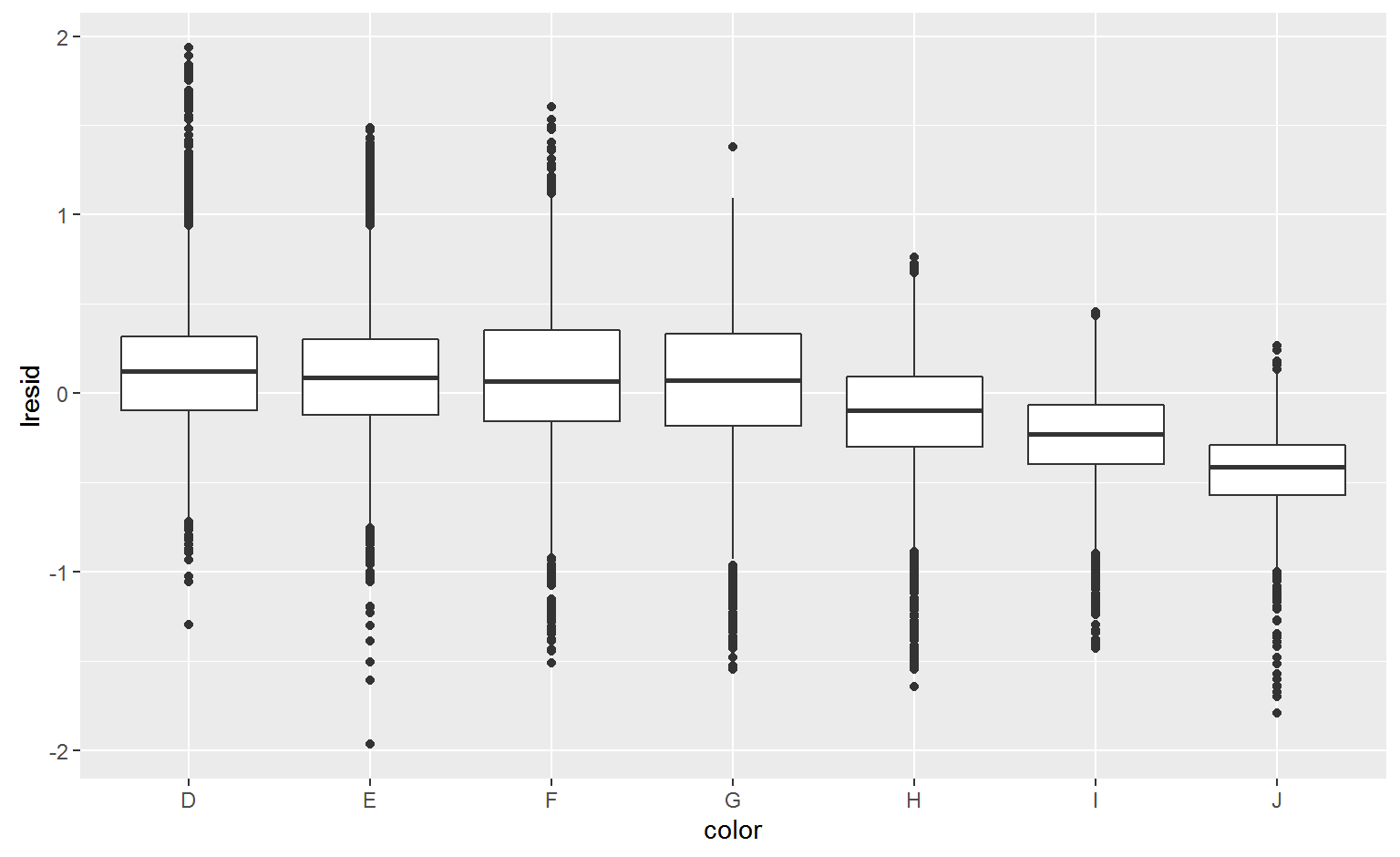
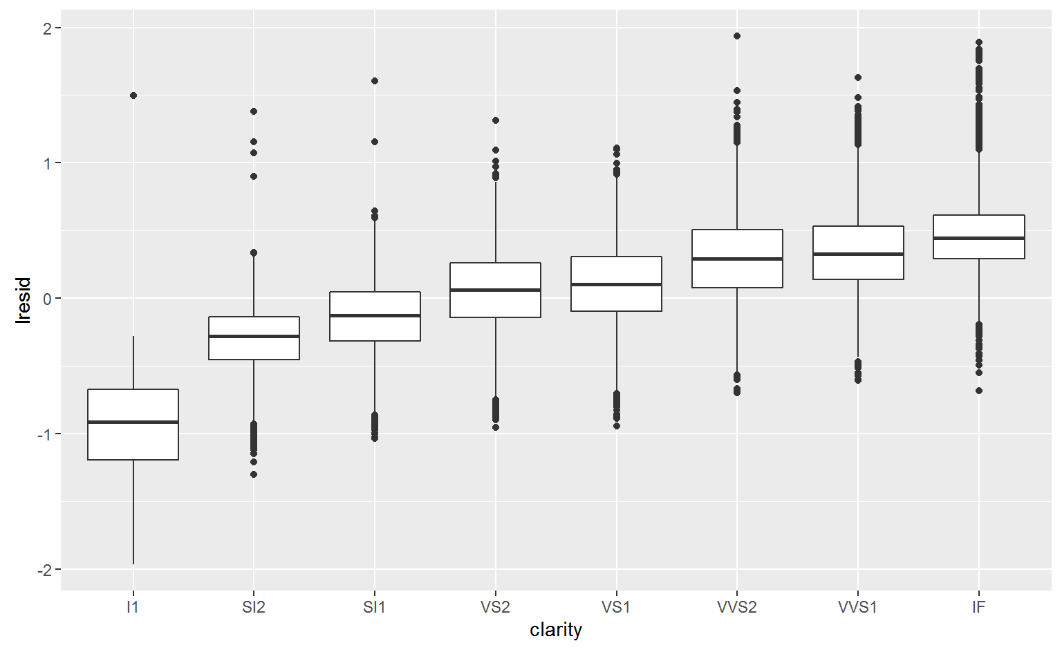
Why are low quality diamonds more expensive?
ggplot(diamonds, aes(cut, price)) + geom_boxplot()
ggplot(diamonds, aes(color, price)) + geom_boxplot()
ggplot(diamonds, aes(clarity, price)) + geom_boxplot()
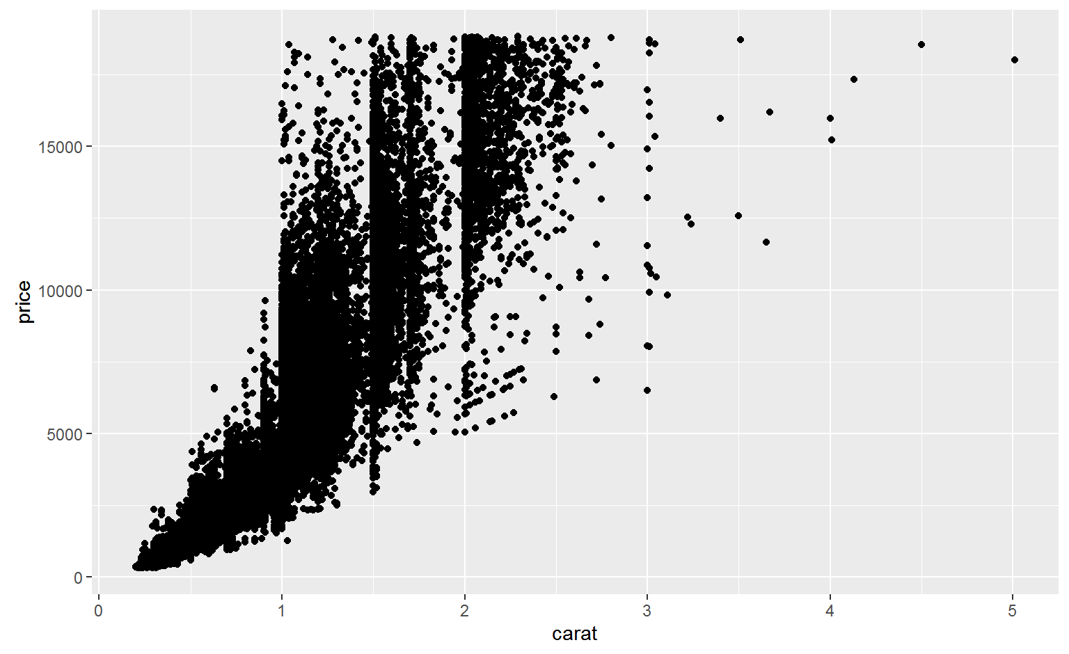
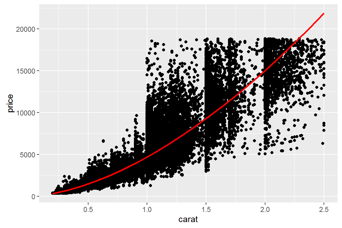
ggplot(diamonds, aes(carat, price)) +
  geom_point()
diamonds2 <- diamonds %>%
  filter(carat <= 2.5) %>%
  mutate(lprice = log2(price), lcarat = log2(carat))
Identify linear pattern so we can remove it
mod_diamond <- lm(lprice ~ lcarat, data = diamonds2)
grid <- diamonds2 %>%
  data_grid(carat = seq_range(carat, 20)) %>%
  mutate(lcarat = log2(carat)) %>%
  add_predictions(mod_diamond, "lprice") %>%
  mutate(price = 2 ^ lprice)
## # A tibble: 20 × 4
##        carat      lcarat    lprice      price
##        <dbl>       <dbl>     <dbl>      <dbl>
## 1  0.2000000 -2.32192809  8.289840   312.9613
## 2  0.3210526 -1.63911827  9.437897   693.5697
## 3  0.4421053 -1.17753819 10.213984  1187.7244
## 4  0.5631579 -0.82838862 10.801034  1784.1663
## 5  0.6842105 -0.54748780 11.273333  2475.2060
## 6  0.8052632 -0.31246777 11.668489  3255.1059
## 7  0.9263158 -0.11042399 12.008199  4119.3452
## 8  1.0473684  0.06676901 12.306126  5064.2274
## 9  1.1684211  0.22456026 12.571432  6086.6476
## 10 1.2894737  0.36678233 12.810560  7183.9430
## 11 1.4105263  0.49623358 13.028216  8353.7936
## 12 1.5315789  0.61501973 13.227939  9594.1507
## 13 1.6526316  0.72476514 13.412462 10903.1859
## 14 1.7736842  0.82674917 13.583935 12279.2526
## 15 1.8947368  0.92199749 13.744083 13720.8562
## 16 2.0157895  1.01134497 13.894309 15226.6312
## 17 2.1368421  1.09548031 14.035772 16795.3226
## 18 2.2578947  1.17497823 14.169437 18425.7712
## 19 2.3789474  1.25032335 14.296120 20116.9016
## 20 2.5000000  1.32192809 14.416515 21867.7116
ggplot(diamonds2, aes(carat, price)) +
  geom_point() +
  geom_line(data = grid, colour = "red", size = 1)
diamonds2 <- diamonds2 %>%
add_residuals(mod_diamond, "lresid")
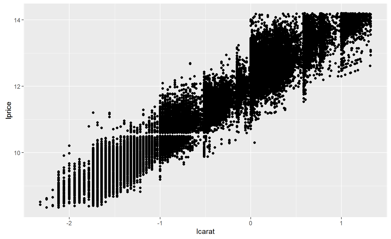
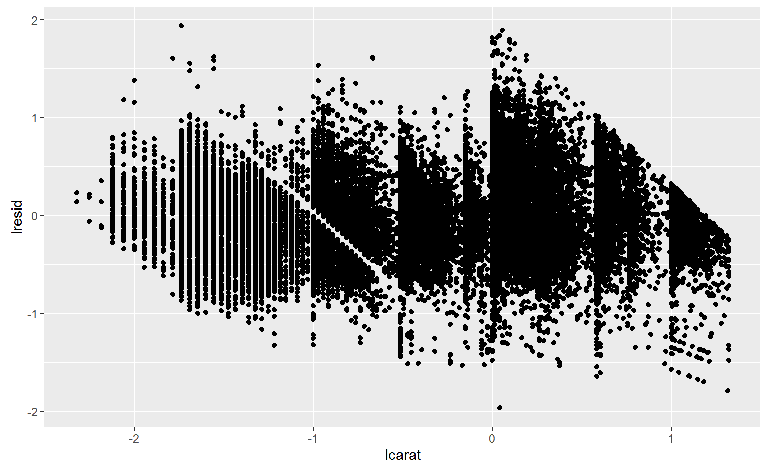
ggplot(diamonds2, aes(lcarat, lresid)) +
geom_point()
Cut
ggplot(diamonds2, aes(cut, lresid)) + geom_boxplot()
Color
ggplot(diamonds2, aes(color, lresid)) + geom_boxplot()
Clarity
ggplot(diamonds2, aes(clarity, lresid)) + geom_boxplot()
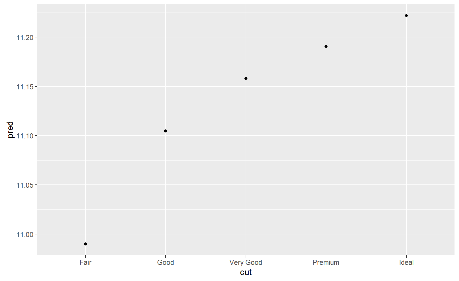
A more complicated model
If we wanted to, we could continue to build up our model, moving the effects we’ve observed into the model to make them explicit. For example, we could include color, cut, and clarity into the model so that we also make explicit the effect of these three categorical variables:
mod_diamond2 <- lm(lprice ~ lcarat + color + cut + clarity, data = diamonds2)
grid <- diamonds2 %>%
  data_grid(cut, .model = mod_diamond2) %>%
  add_predictions(mod_diamond2)
grid
## # A tibble: 5 × 5
##         cut     lcarat color clarity     pred
##       <ord>      <dbl> <chr>   <chr>    <dbl>
## 1      Fair -0.5145732     G     SI1 10.98985
## 2      Good -0.5145732     G     SI1 11.10479
## 3 Very Good -0.5145732     G     SI1 11.15824
## 4   Premium -0.5145732     G     SI1 11.19055
## 5     Ideal -0.5145732     G     SI1 11.22187
ggplot(grid, aes(cut, pred)) +
  geom_point()
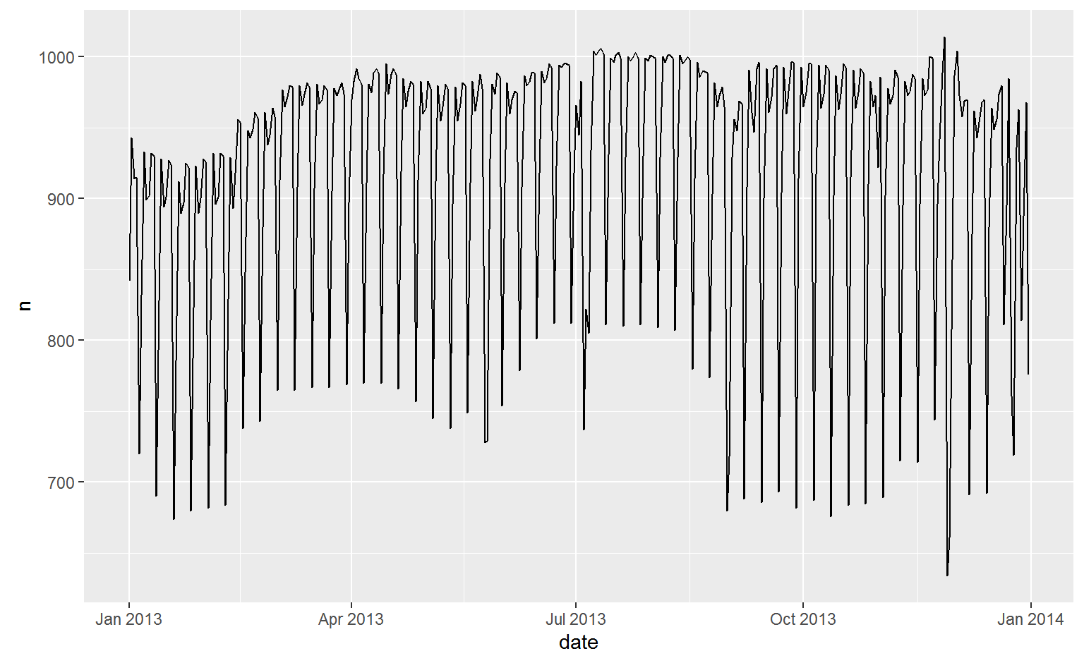
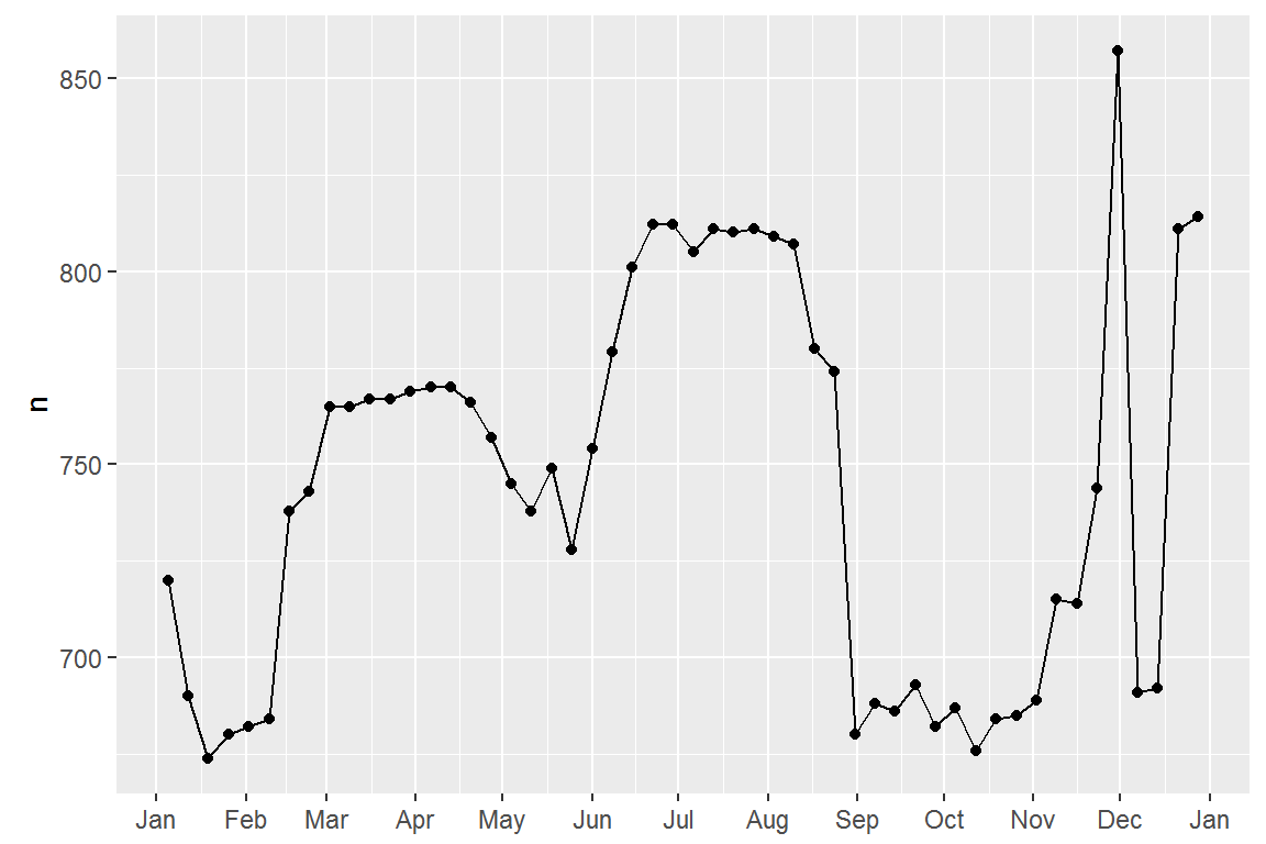
What affects the number of daily flights?
daily <- flights %>%
  mutate(date = make_date(year, month, day)) %>%
  group_by(date) %>%
  summarise(n = n())
daily
## # A tibble: 365 × 2
##          date     n
##        <date> <int>
## 1  2013-01-01   842
## 2  2013-01-02   943
## 3  2013-01-03   914
## 4  2013-01-04   915
## 5  2013-01-05   720
## 6  2013-01-06   832
## 7  2013-01-07   933
## 8  2013-01-08   899
## 9  2013-01-09   902
## 10 2013-01-10   932
## # ... with 355 more rows
ggplot(daily, aes(date, n)) +
  geom_line()
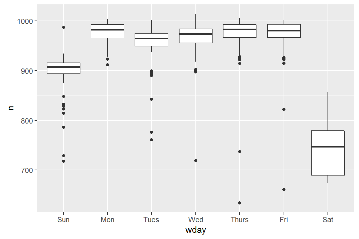
Day of week
Understanding the long-term trend is challenging because there’s a very strong day-of-week effect that dominates the subtler patterns. Let’s start by looking at the distribution of flight numbers by day-of-week:
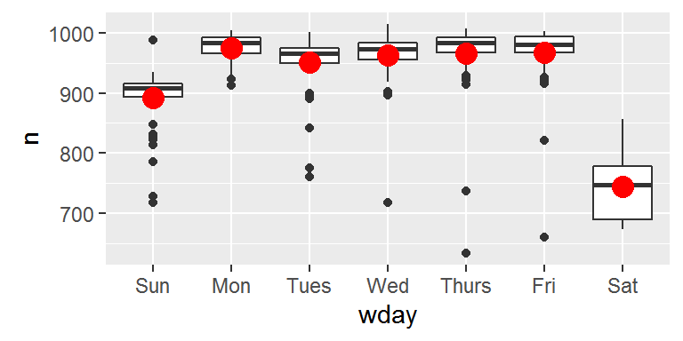
One way to remove this strong pattern is to use a model. First, we fit the model, and display its predictions overlaid on the original data:
mod <- lm(n ~ wday, data = daily)

grid <- daily %>%
  data_grid(wday) %>%
  add_predictions(mod, "n")

ggplot(daily, aes(wday, n)) +
  geom_boxplot() +
  geom_point(data = grid, colour = "red", size = 4)
Next we compute and visualise the residuals:
daily <- daily %>%
  add_residuals(mod)
daily %>%
  ggplot(aes(date, resid)) +
  geom_ref_line(h = 0) +
  geom_line()
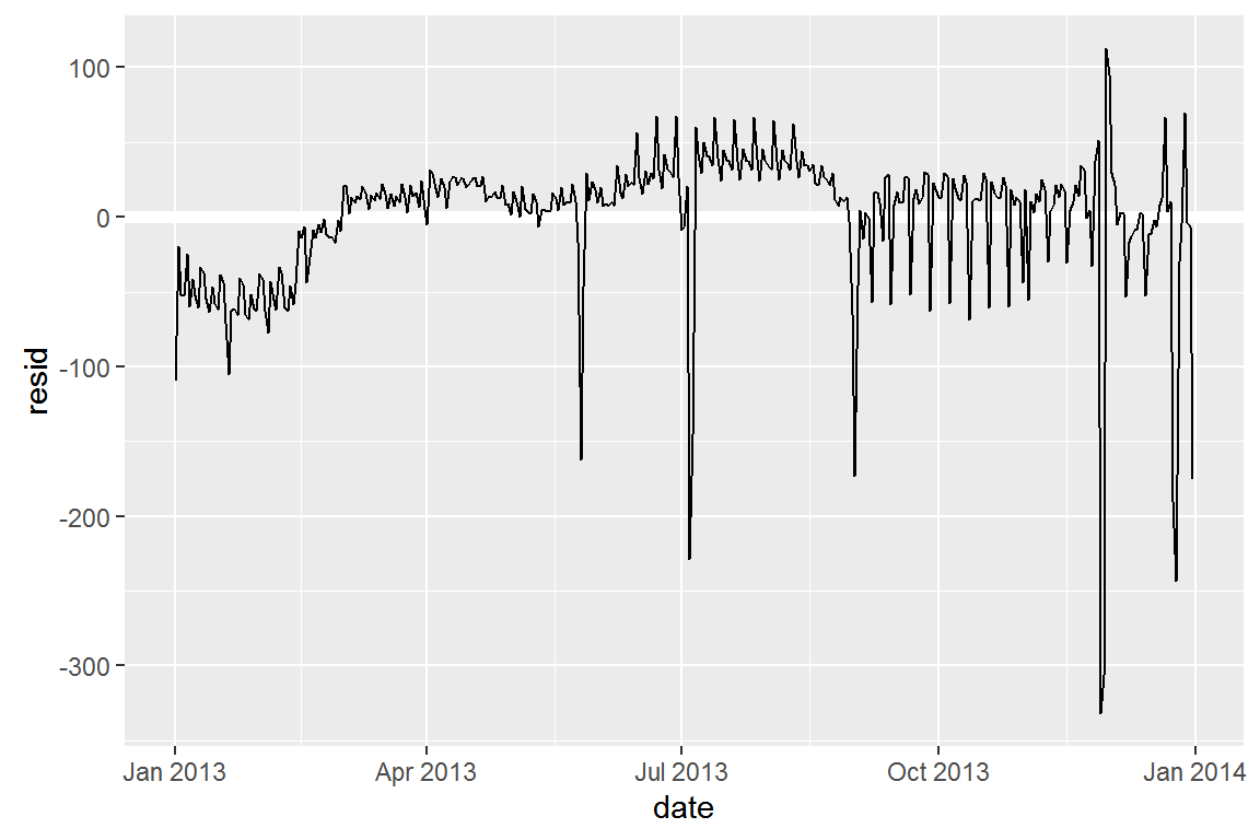
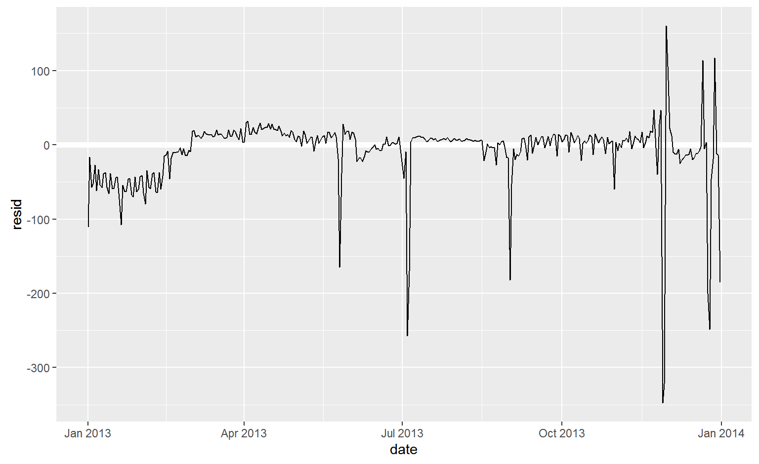
Our model seems to fail starting in June: you can still see a strong regular pattern that our model hasn’t captured. Drawing a plot with one line for each day of the week makes the cause easier to see:
    ggplot(daily, aes(date, resid, colour = wday)) +
      geom_ref_line(h = 0) +
      geom_line()
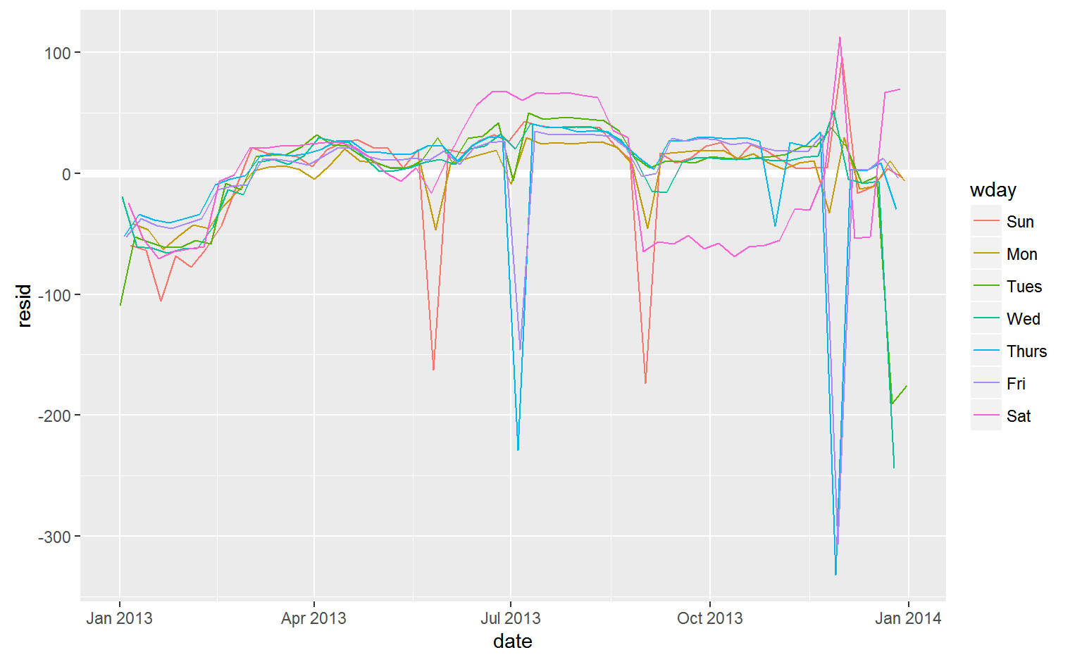
There are some days with far fewer flights than expected:
    daily %>%
      filter(resid < -100)
## # A tibble: 11 × 4
##          date     n  wday     resid
##        <date> <int> <ord>     <dbl>
## 1  2013-01-01   842  Tues -109.3585
## 2  2013-01-20   786   Sun -105.4808
## 3  2013-05-26   729   Sun -162.4808
## 4  2013-07-04   737 Thurs -228.7500
## 5  2013-07-05   822   Fri -145.4615
## 6  2013-09-01   718   Sun -173.4808
## 7  2013-11-28   634 Thurs -331.7500
## 8  2013-11-29   661   Fri -306.4615
## 9  2013-12-24   761  Tues -190.3585
## 10 2013-12-25   719   Wed -243.6923
## 11 2013-12-31   776  Tues -175.3585
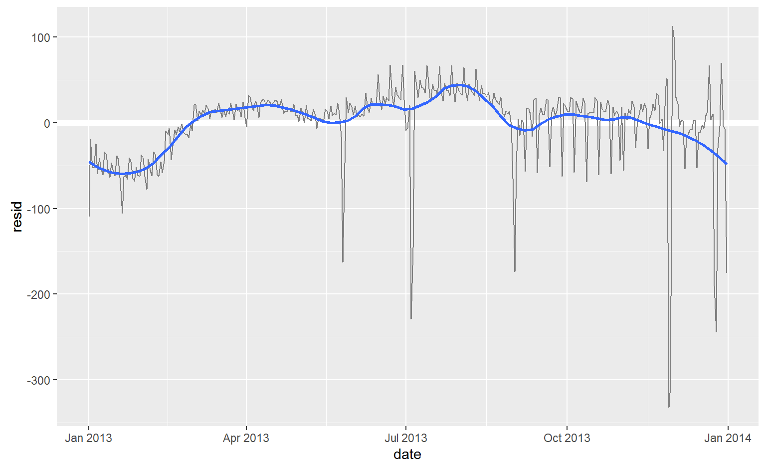
There seems to be some smoother long term trend over the course of a year. We can highlight that trend with geom_smooth():
    daily %>%
      ggplot(aes(date, resid)) +
      geom_ref_line(h = 0) +
      geom_line(colour = "grey50") +
      geom_smooth(se = FALSE, span = 0.20)
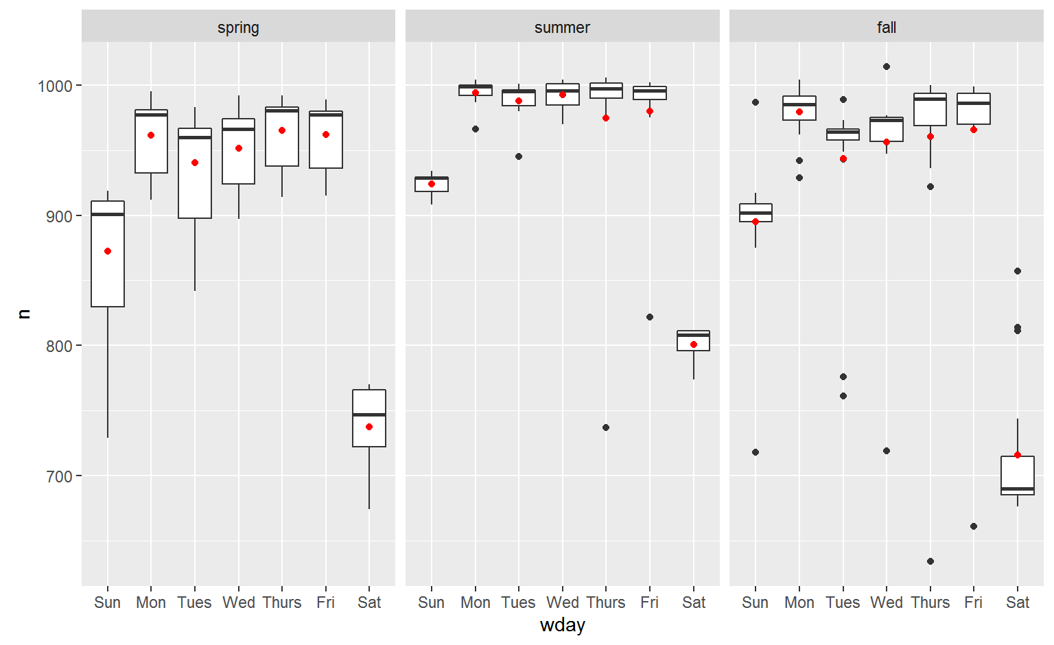
Seasonal Saturday effect
Let’s first tackle our failure to accurately predict the number of flights on Saturday. A good place to start is to go back to the raw numbers, focussing on Saturdays:
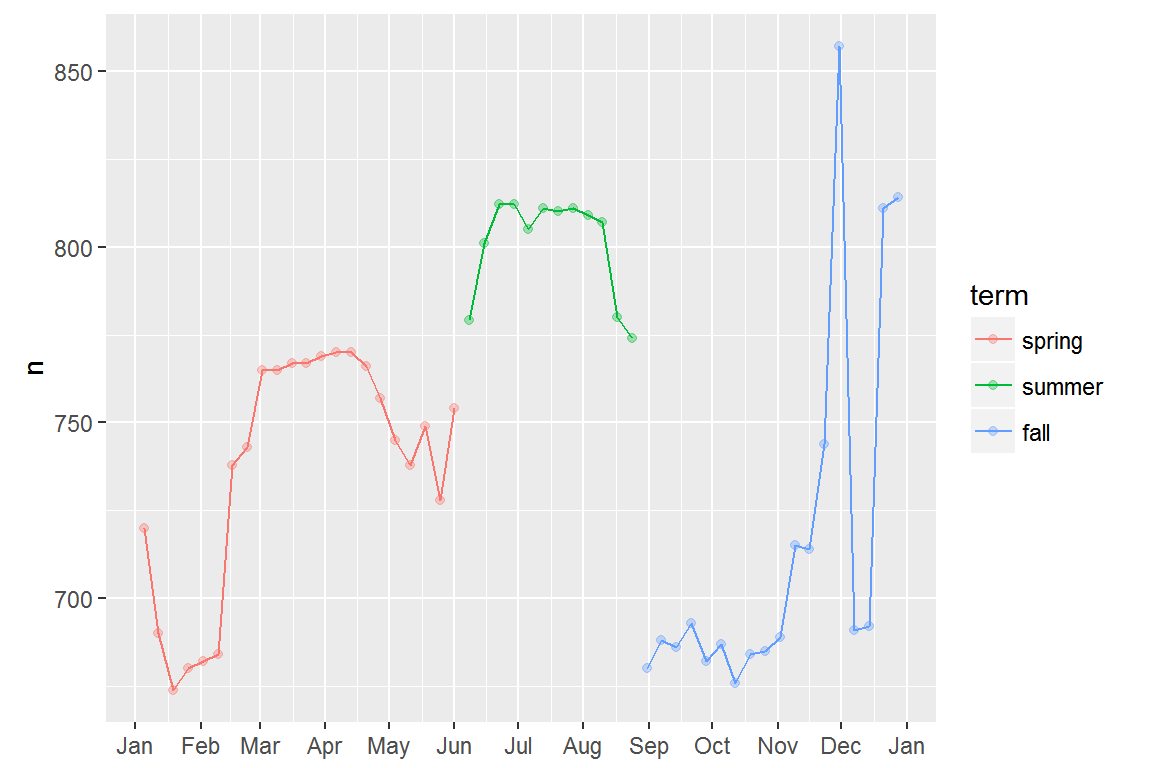
Lets create a “term” variable that roughly captures the three school terms, and check our work with a plot:
term <- function(date) {
  cut(date,
    breaks = ymd(20130101, 20130605, 20130825, 20140101),
    labels = c("spring", "summer", "fall")
  )
}

daily <- daily %>%
  mutate(term = term(date))
daily %>%
  filter(wday == "Sat") %>%
  ggplot(aes(date, n, colour = term)) +
  geom_point(alpha = 1/3) +
  geom_line() +
  scale_x_date(NULL, date_breaks = "1 month", date_labels = "%b")
It’s useful to see how this new variable affects the other days of the week:
daily %>%
  ggplot(aes(wday, n, colour = term)) +
    geom_boxplot()
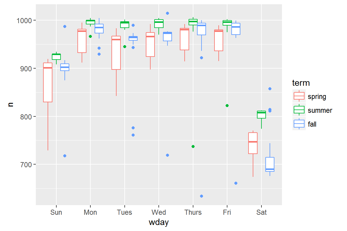
It looks like there is significant variation across the terms, so fitting a separate day of week effect for each term is reasonable.
mod1 <- lm(n ~ wday, data = daily)
mod2 <- lm(n ~ wday * term, data = daily)
This improves our model, but not as much as we might hope:
daily %>%
  gather_residuals(without_term = mod1, with_term = mod2) %>%
  ggplot(aes(date, resid, colour = model)) +
    geom_line(alpha = 0.75)
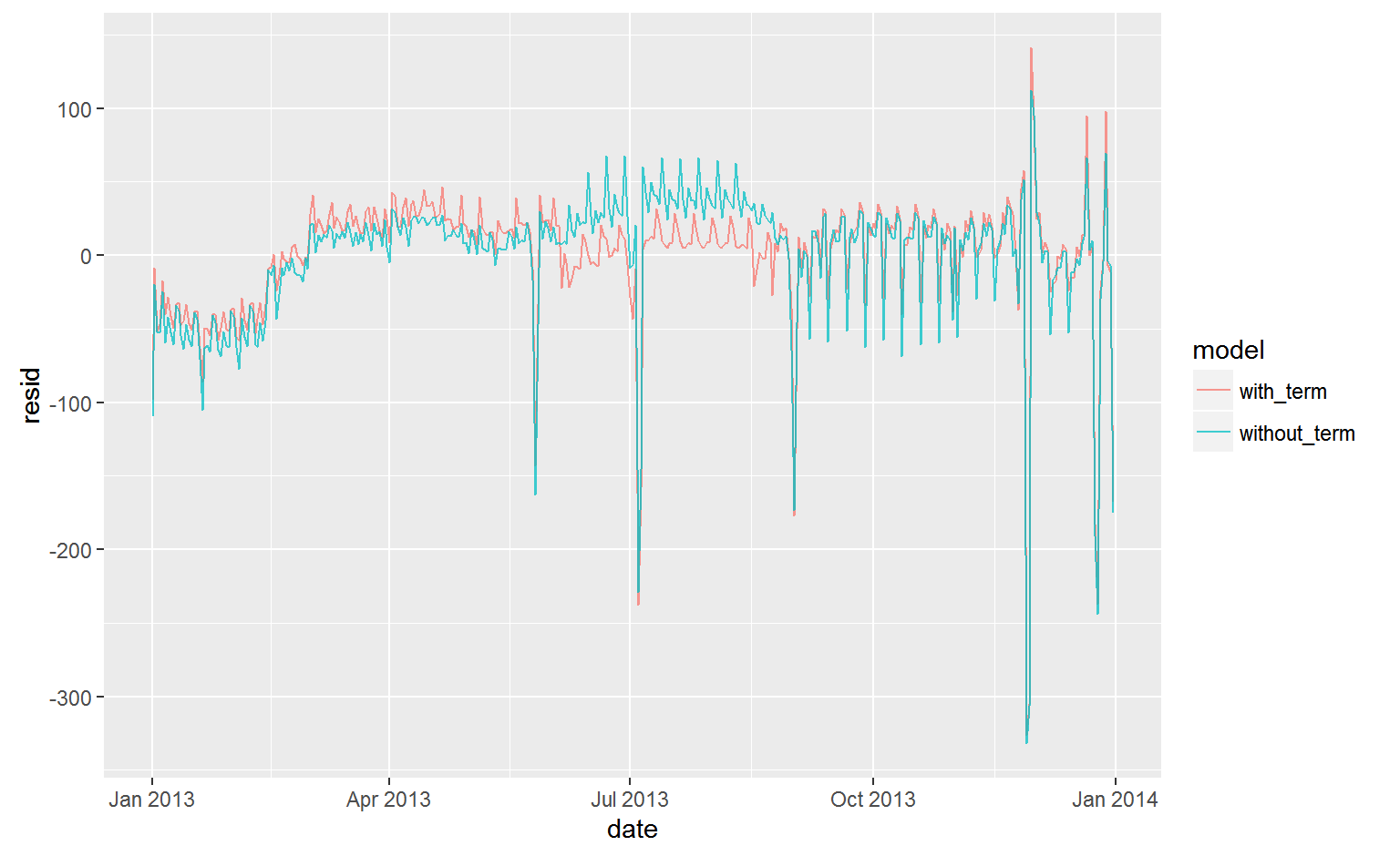
We can see the problem by overlaying the predictions from the model on to the raw data:
Our model is finding the mean effect, but we have a lot of big outliers, so mean tends to be far away from the typical value. We can alleviate this problem by using a model that is robust to the effect of outliers: MASS::rlm(). This greatly reduces the impact of the outliers on our estimates, and gives a model that does a good job of removing the day of week pattern:
mod3 <- MASS::rlm(n ~ wday * term, data = daily)
daily %>%
  add_residuals(mod3, "resid") %>%
  ggplot(aes(date, resid)) +
  geom_hline(yintercept = 0, size = 2, colour = "white") +
  geom_line()